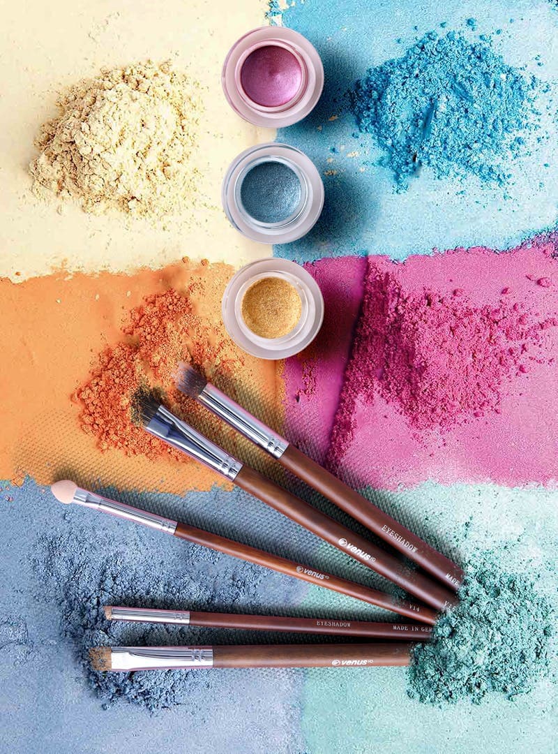
Choosing colors for a design project used to mean opening a color wheel, picking a starting color, and then spending an embarrassing amount of time trying to find four or five other colors that look good together. You would scroll through Dribbble for inspiration, save screenshots, copy hex codes, and still end up with a palette that felt off somehow.
AI color palette generators changed the process by letting you describe what you want in plain words. Type "warm sunset over the ocean" and get five harmonious colors that capture that feeling. Type "corporate and trustworthy but not boring" and get a palette that balances professionalism with visual interest.
The technology behind this is surprisingly elegant, and the results are often better than what most non-designers would come up with manually. But understanding how these tools work helps you get better results and know when to trust them and when to override their suggestions.
How AI Generates Color Palettes
AI palette generators use one of two main approaches, and some combine both:
Text-to-color models are trained on datasets that pair color values with descriptive language. The model learns associations: "ocean" maps to blues and teals, "autumn" maps to oranges and deep reds, "luxury" maps to golds and blacks. When you type a prompt, the model generates colors that match the learned associations.
These models work well because color-mood associations are surprisingly consistent across cultures. Research in color psychology shows that people largely agree on which colors feel warm, cool, energetic, calming, professional, or playful. The AI exploits these shared associations.
Image-to-palette models extract dominant colors from photographs or artwork. Upload a photo of a forest, and the tool pulls out the specific greens, browns, and filtered light tones from that image. This approach is more precise because it works with actual color values rather than abstract concepts.
The best tools combine both approaches. You can type a description to get a starting palette, then refine it by locking colors you like and regenerating the rest. The Color Picker is useful for fine-tuning individual colors after the AI generates the initial palette.

Getting Better Results From Text Prompts
The quality of your output depends heavily on how you describe what you want. Vague prompts give generic results. Specific prompts give palettes that actually match your vision.
Be specific about mood, not just objects. "Forest" gives you generic greens. "Misty Pacific Northwest forest at dawn" gives you muted, cool greens with soft grays and touches of golden light. The modifier words matter more than the noun.
Mention the medium. "Colors for a mobile app" produces different results than "colors for a print magazine." The AI adjusts for screen vs print considerations, vibrancy levels, and contrast requirements.
Include what you do not want. "Professional and modern, but not the typical blue and gray corporate palette" tells the AI to avoid cliches while staying professional. Negative constraints are often more useful than positive ones.
Reference existing brands or aesthetics. "Similar to Spotify's energy but warmer" or "the aesthetic of a Japanese tea house" gives the AI a concrete reference point. This works better than abstract concepts like "nice" or "beautiful."
Specify the number of colors. A 3-color palette is very different from a 7-color palette. Most design projects need 5-6 colors: a primary, a secondary, a neutral, a background, and one or two accents.
The quality of your output depends heavily on how you describe what you want.
Color Harmony Rules the AI Follows
Even when generating colors from text, good AI palette generators apply color theory principles under the hood:
Complementary palettes use colors opposite each other on the color wheel (like blue and orange). These create high contrast and visual energy.
Analogous palettes use colors adjacent on the color wheel (like blue, blue-green, and green). These feel harmonious and cohesive but can lack contrast.
Triadic palettes use three colors equally spaced on the wheel. These are vibrant and balanced, often used in playful or energetic designs.
Split-complementary palettes take one base color and pair it with two colors adjacent to its complement. This gives contrast without the intensity of a pure complementary scheme.
The AI typically generates palettes that follow one of these harmony rules, which is why the results look professionally coordinated even when the input prompt is casual.
You can use the Color Converter to analyze generated palettes in HSL format. If the hue values are evenly spaced (120 degrees apart for triadic, 180 degrees for complementary), the AI is following a specific harmony rule. Understanding this helps you adjust individual colors while maintaining the overall balance.
Coolors Alternatives and Free Tools
Coolors is the most well-known palette generator, but several alternatives offer different strengths:
Coolors (coolors.co) remains excellent for quick palette generation with its spacebar-to-generate interface. The free tier is generous, and the lock-and-regenerate workflow is intuitive.
Huemint (huemint.com) generates palettes specifically for UI design. It shows colors applied to actual interface mockups, so you can see how your palette looks on a real website rather than as abstract swatches.
Khroma (khroma.co) learns your color preferences over time. You train it by picking colors you like, and it generates palettes tailored to your taste. The results improve the more you use it.
Realtime Colors (realtimecolors.com) applies your palette to a live website template as you adjust colors. This eliminates the gap between picking colors in isolation and seeing them in context.
Color Hunt (colorhunt.co) is a community-driven palette library. Instead of generating palettes, you browse thousands of user-submitted combinations. Useful when you want proven palettes that real designers have used.
For individual color selection and adjustment, the Color Picker gives you precise control with HEX, RGB, and HSL values. The Gradient Generator extends your palette into smooth gradients for backgrounds and overlays.
Applying AI-Generated Palettes to Real Projects
A palette is just five color swatches until you assign each color a role in your design:
Primary color: Your brand's dominant color. Used for main buttons, headers, links, and key interactive elements. This should be the most recognizable color in your palette.
Secondary color: Supports the primary. Used for secondary buttons, cards, and visual accents. It should complement the primary without competing for attention.
Background color: The canvas your content sits on. Usually the lightest color in the palette (or the darkest, for dark themes). It needs to provide enough contrast for text readability.
Surface color: Slightly different from the background. Used for cards, panels, modals, and elevated surfaces. The difference between background and surface creates visual depth.
Accent color: Used sparingly for notifications, alerts, highlights, and interactive states. Often the most saturated or unusual color in the palette.
Neutral/text color: For body text, borders, dividers, and muted UI elements. Often a desaturated version of the primary color works better than pure gray.
Before committing to a palette, test it for accessibility. The contrast ratio between text and background colors must meet WCAG standards (4.5:1 for normal text, 3:1 for large text). The prettiest palette in the world is useless if people cannot read the text.
FAQ
Can AI generate accessible color palettes?
Some tools specifically generate palettes that meet WCAG contrast requirements. Others generate aesthetically pleasing palettes without checking accessibility. Always verify contrast ratios yourself using a contrast checker. The AI may produce beautiful colors that fail readability tests when used as text-on-background combinations.
How many colors should a design palette have?
Most projects work best with 5-7 colors: 1-2 primary/secondary, 1-2 neutrals, 1 background, and 1-2 accents. Fewer than 4 can feel monotone. More than 8 creates visual chaos unless you have a strong design system. Additional shades and tints (lighter and darker versions of each color) extend the palette without adding new hues.
Do AI palette generators work for print design?
Yes, but you need to verify that the generated colors are reproducible in CMYK. Screen colors (RGB) do not always translate accurately to print. Use a color converter to check the CMYK values and confirm that no colors fall outside the printable gamut.
Can I trademark a color palette?
You can trademark a specific color in the context of your industry (like Tiffany blue), but you cannot trademark a palette or generic color combination. The legal protection is narrow: it applies only to the specific shade in the specific product category where you have established consumer association.
### Can AI generate accessible color palettes.
LLM Pricing Comparison 2026: How Much Does AI Really Cost?
LLM pricing compared: GPT-4o, Claude, Gemini, Llama, Mistral, DeepSeek. Cost per million tokens, batch discounts, and budget examples to plan your AI spend.
How to Fine-Tune LLMs: Data Format Guide for 2026
Fine-tuning data format guide for OpenAI, Anthropic, and Google. JSONL examples, validation tips, and best practices for preparing training data.
AI Context Windows and Token Limits Explained
Context window and token limits explained: what they are, how they differ across GPT-4o, Claude, and Gemini, and strategies for managing token constraints.