Every platform has opinions about how your images and videos should look. YouTube wants 16:9. Instagram feed posts look best at 4:5. TikTok and Reels demand 9:16. LinkedIn prefers 1.91:1 for link previews. Twitter crops images unpredictably unless you nail the right ratio before uploading.
Getting these wrong is not catastrophic, but the results are always disappointing. A thumbnail with the subject's head cropped off. A product photo with awkward white bars on the sides. A video that plays in a tiny window because the platform letterboxed it to fit.
Aspect ratio calculators solve this by letting you input one dimension and automatically computing the other. You know you need a 16:9 video that is 1920 pixels wide, and the calculator tells you the height is 1080 pixels. Simple math, but easier to look up than to compute in your head every time.
What Aspect Ratios Actually Mean
An aspect ratio is the proportional relationship between width and height. When someone says 16:9, they mean the width is 16 units for every 9 units of height. The actual pixel count does not matter. A 1920x1080 image is 16:9. So is 1280x720, 3840x2160, and 640x360. They are all the same shape, just different sizes.
The colon notation (16:9) always simplifies to the lowest common ratio. A 1920x1080 image technically has a ratio of 1920:1080, which simplifies to 16:9. Some ratios do not simplify to neat numbers. A 1200x628 image (common for Facebook link previews) has a ratio of roughly 1.91:1, which is why you will sometimes see decimal notation instead.
Common aspect ratios you will encounter:
- 16:9 - Standard widescreen. YouTube, desktop video, presentations.
- 9:16 - Vertical video. TikTok, Instagram Reels, YouTube Shorts.
- 4:3 - Classic TV and older monitor format. Still used in some presentations.
- 1:1 - Square. Instagram posts (optional), profile pictures.
- 4:5 - Tall rectangle. Instagram feed posts, Pinterest pins.
- 21:9 - Ultra-wide. Cinematic video, ultra-wide monitors.
- 2:3 - Portrait photos. Standard print sizes (4x6 inches).
The Image Resizer handles all of these. Upload an image, select your target ratio, and the tool scales it correctly without stretching or distortion.
Platform-Specific Requirements in 2026
Social media platforms update their recommended dimensions regularly. Here is what works as of mid-2026:
YouTube: Thumbnails at 1280x720 (16:9). Video at 1920x1080 minimum, 3840x2160 for 4K. Shorts at 1080x1920 (9:16).
Instagram: Feed posts at 1080x1350 (4:5) for maximum screen real estate. Stories and Reels at 1080x1920 (9:16). Carousels at 1080x1080 (1:1) or 1080x1350 (4:5).
TikTok: 1080x1920 (9:16). Content shot in other ratios gets letterboxed with blurred backgrounds, which looks noticeably worse than native vertical video.
LinkedIn: Shared images at 1200x627 (roughly 1.91:1). Article cover images at 1200x644. Video at 1920x1080 (16:9) for landscape or 1080x1920 for vertical.
Twitter/X: In-feed images at 1600x900 (16:9) for single images. Multiple images crop to varying ratios depending on how many you attach.
Pinterest: Pins at 1000x1500 (2:3). Idea Pins at 1080x1920 (9:16).
The safest approach is to create your source image at the highest resolution you need, then use the Image Crop tool to cut versions for each platform. Start with a 4K source and crop down rather than trying to upscale a small image later.
Social media platforms update their recommended dimensions regularly.
Resizing Without Losing Quality
There are two fundamentally different operations that people confuse: resizing and cropping.
Resizing changes the pixel dimensions while keeping the same aspect ratio. A 3000x2000 image resized to 1500x1000 looks identical, just smaller. Every pixel in the original maps proportionally to the new version. No information is lost in a meaningful way.
Cropping removes parts of the image to change the aspect ratio. A 3000x2000 image (3:2) cropped to 2000x2000 (1:1) loses the outer 500 pixels on each side. The center of the image stays the same resolution, but the composition changes.
Problems happen when you try to force an aspect ratio change without cropping. Stretching a 4:3 image to fill a 16:9 frame distorts everything. People look wider, circles become ovals, and the image looks obviously wrong. The alternative is letterboxing (adding black or white bars), which preserves the image but wastes screen space.
The right workflow is: shoot or create at the highest resolution possible, crop to your target ratio using a tool that lets you position the crop area, then resize to your target pixel dimensions. The Image Resizer handles the resize step, and the Image Crop handles the crop step.
Aspect Ratios for Web Design and Responsive Layouts
Aspect ratios matter beyond social media. In web design, maintaining consistent ratios across a grid of images creates visual harmony. A portfolio page where all thumbnails are the same ratio looks intentional and professional. A page where images have random ratios looks like nobody planned the layout.
CSS has a native aspect-ratio property that handles this elegantly:
`css
.thumbnail {
aspect-ratio: 16 / 9;
width: 100%;
object-fit: cover;
}
`
This ensures the container always maintains a 16:9 ratio regardless of the viewport width. The object-fit: cover property scales the image to fill the container, cropping the excess rather than distorting.
For responsive grids, combine aspect ratio with CSS Grid:
`css
.gallery {
display: grid;
grid-template-columns: repeat(auto-fill, minmax(280px, 1fr));
gap: 16px;
}
.gallery img {
aspect-ratio: 4 / 3;
width: 100%;
object-fit: cover;
border-radius: 8px;
}
`
The Grid Calculator helps you figure out column counts and gap sizes for different viewport widths. Combined with the aspect-ratio property, you get layouts that look consistent across every screen size.
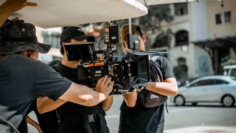
Video Aspect Ratios: Shooting and Editing Tips
Most cameras shoot in 16:9 by default, which works for YouTube and desktop viewing but requires cropping for vertical platforms. If you know your content will go on TikTok or Reels, shooting in 9:16 from the start produces better results than cropping a horizontal video later.
Some practical tips for working with video ratios:
Shoot wider than you need. If you plan to crop a 16:9 video to 9:16 for Shorts, frame your subject in the center third of the frame. This gives you room to crop without losing the subject.
Use safe zones. Most video editors show safe zone overlays. Keep critical content (faces, text, products) inside the inner safe zone. Content at the edges may get cropped on different platforms.
Match your timeline to your output. Set your video editing timeline to the target aspect ratio before you start editing. Editing in 16:9 and exporting as 9:16 at the end often creates framing problems you did not notice during editing.
Test on mobile before publishing. Preview your video on a phone screen before uploading. Desktop monitors hide framing problems that become obvious on a small screen.
Consider multiple exports. For important content, export the same video in both 16:9 and 9:16. Reframe the shots for each version rather than just cropping. This takes more time but produces significantly better results on each platform.
Print Aspect Ratios vs Screen Aspect Ratios
Screen and print dimensions use different ratio systems, which causes confusion when preparing images for both.
Common print sizes in inches and their aspect ratios:
- 4x6 = 2:3
- 5x7 = 5:7
- 8x10 = 4:5
- 11x14 = 11:14
- 16x20 = 4:5
Notice that none of these match 16:9, the most common screen ratio. A photo taken with a phone (typically 4:3 or 16:9) will need cropping for any standard print size. This is why professional photographers shoot at the highest resolution possible and deliver files in the native camera ratio. The client or printer then crops to the specific print size needed.
For print work, resolution matters more than pixel dimensions. A 300 DPI (dots per inch) image at 4x6 inches needs to be at least 1200x1800 pixels. The same image for web display at 72 DPI only needs 288x432 pixels. Always ask your printer for their minimum DPI requirement before preparing files.
If you are preparing images for both web and print from the same source, start with the print version (higher resolution, specific crop) and then resize down for web. Going the other direction means you are trying to add detail that does not exist.
Screen and print dimensions use different ratio systems, which causes confusion when preparing images for both.
FAQ
What happens if I upload a video with the wrong aspect ratio?
Most platforms will either letterbox it (add black bars to fill the frame) or crop it automatically. YouTube adds black bars. Instagram center-crops. TikTok adds a blurred version of the video as the background. None of these look as good as uploading in the native ratio.
Can I change the aspect ratio of a photo without cropping?
Not without either stretching (which distorts the image) or adding padding (which adds empty space around the edges). Content-aware fill in tools like Photoshop can generate new pixels to fill the extra space, but the results vary widely depending on the image content.
What is the best aspect ratio for website hero images?
There is no single best ratio because hero sections vary by design. Common choices are 16:9 (standard widescreen), 21:9 (ultra-wide cinematic), or 3:1 (very wide banner). Use the CSS aspect-ratio property so the image adapts to the container rather than forcing a fixed pixel size.
Why do some platforms show my image differently than how I uploaded it?
Platforms apply their own cropping logic depending on how many images you attach, the device viewing the content, and the placement (feed vs. profile vs. story). The only way to control this reliably is to match the platform's recommended dimensions exactly before uploading.
CSS Layout Tools: Grid, Flexbox, Gradients and Shadows
A practical guide to CSS Grid, Flexbox, gradients, and box shadows. Learn when to use each layout technique and generate clean CSS code fast.
Edit Images in Your Browser: Resize, Compress, Convert
Handle common image tasks in your browser without installing software. Resize, compress, convert formats, and inspect EXIF metadata in seconds.
CSS Generators: Gradients, Flexbox, Grid and Shadows
Use CSS generators to create gradients, flexbox layouts, grid systems, and box shadows. Visual editors output ready-to-copy CSS for your project.