Buttons seem like the simplest UI element. A colored rectangle with text in it. Yet designers and developers spend a disproportionate amount of time getting buttons right, because buttons carry a lot of weight in any interface.
A well-designed button communicates what it does, how important it is relative to other actions, and whether it is clickable right now. A poorly designed button leaves users guessing: "Is this clickable? What happens if I click it? Is this the main action or a secondary one?"
CSS button generators take the trial-and-error out of button design. Instead of tweaking padding, border-radius, box-shadow, and hover states by hand, you adjust visual controls and copy the resulting CSS. The output is clean, production-ready code that works across browsers.
Button Hierarchy: Primary, Secondary, and Ghost
Every interface needs at least two button styles, and most need three.
Primary buttons are the main action on the page. They have the strongest visual presence: solid background color, high contrast text, and usually the largest size. There should be only one primary button per screen section. If everything is a primary button, nothing is.
Secondary buttons support alternative actions. They are visually distinct from primary buttons but less prominent: outlined (border only, no fill), muted colors, or smaller size. "Cancel," "Go Back," and "Save as Draft" are typical secondary actions.
Ghost buttons are the lightest option. Transparent background, subtle border or no border at all, just text with a hover effect. Use these for tertiary actions that should be available but not visually competing with primary or secondary buttons.
Pick a color palette first so primary, secondary, and ghost buttons share a coherent visual language. Decide on the fill, border, and text colors once, and every button you build inherits that consistency.
The CSS Properties That Make or Break a Button
Modern buttons rely on a handful of CSS properties that work together. Getting any single one wrong can make an otherwise polished button feel cheap.
padding controls the internal spacing between the text and the button edge. The common mistake is making padding too tight. A good starting point is padding: 12px 24px for standard buttons and padding: 16px 32px for larger call-to-action buttons. Vertical padding should be roughly half the horizontal padding.
border-radius rounds the corners. Sharp corners (0px) feel formal and structured. Slightly rounded corners (4-8px) are the modern default. Fully rounded (9999px) creates pill-shaped buttons that feel playful. Pick one radius and use it consistently.
box-shadow adds depth. A subtle shadow makes buttons feel elevated and clickable. The trick is subtlety: box-shadow: 0 2px 4px rgba(0,0,0,0.1) is usually enough. Heavier shadows look dated. Use the CSS Box Shadow Generator to fine-tune shadow values without guessing.
font-weight and font-size are often overlooked. Button text should be slightly bolder than body text (font-weight: 500 or 600) and sized appropriately for the button's importance. Primary buttons can be 16px, secondary buttons 14px.
transition makes hover and focus states smooth. Always add transition: all 0.2s ease or target specific properties like transition: background-color 0.2s, transform 0.2s. Without transitions, state changes feel jarring.
Modern buttons rely on a handful of CSS properties that work together.
Hover, Focus, and Active States (Do Not Skip These)
A button without hover and focus states is an accessibility and usability failure. Users need visual feedback that confirms "yes, this element is interactive" and "yes, your click registered."
Hover state triggers when the mouse cursor is over the button. Common approaches: darken the background by 10-15%, add or intensify a shadow, slightly scale up the button (transform: scale(1.02)). Pick one effect, not all three.
`css
.button:hover {
background-color: #2563eb;
box-shadow: 0 4px 8px rgba(0,0,0,0.15);
}
`
Focus state is critical for keyboard navigation. When a user tabs to a button, it must be visually obvious which button has focus. The default browser outline works but looks ugly. Replace it with a custom focus ring:
`css
.button:focus-visible {
outline: 2px solid #2563eb;
outline-offset: 2px;
}
`
Use :focus-visible instead of :focus so the ring only appears during keyboard navigation, not on mouse clicks.
Active state triggers during the click itself. A subtle scale-down (transform: scale(0.98)) or color shift gives tactile feedback:
`css
.button:active {
transform: scale(0.98);
}
`
Disabled state should make the button look unavailable: reduced opacity, muted colors, and cursor: not-allowed. Remove hover effects on disabled buttons so they do not appear clickable.
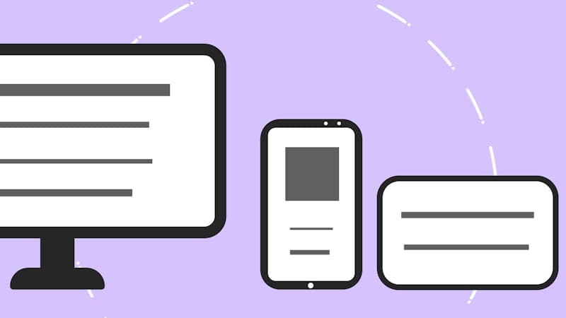
Button Sizing for Responsive Design
Buttons that look perfect on desktop can be too small to tap on mobile. The minimum touch target size recommended by both Apple and Google is 44x44 pixels. If your button is smaller than that, mobile users will struggle to tap it accurately.
For responsive button sizing, use relative units instead of fixed pixel values:
`css
.button {
padding: 0.75rem 1.5rem;
font-size: 1rem;
min-height: 2.75rem; / 44px at default font size /
}
`
On small screens, buttons often work best as full-width elements. A common pattern is using width: 100% on mobile and width: auto on desktop:
`css
.button {
width: 100%;
}
@media (min-width: 640px) {
.button {
width: auto;
}
}
`
For button groups (like "Save" next to "Cancel"), stack them vertically on mobile and display them inline on larger screens. This prevents tiny buttons crammed side by side on a 375px-wide phone screen.
Always test your buttons on an actual phone, not just in a browser's responsive mode. The visual size might look right in the browser simulator, but the actual tap target feel on a real touch screen is different.
Buttons that look perfect on desktop can be too small to tap on mobile.
Loading and Success States
What happens after a user clicks a button? If nothing visually changes for two seconds while a form submits, users will click again. And again. Now you have three form submissions.
Loading state replaces the button text with a spinner or loading animation and disables the button to prevent double-clicks:
`css
.button--loading {
pointer-events: none;
opacity: 0.7;
position: relative;
}
.button--loading::after { content: ''; width: 16px; height: 16px; border: 2px solid transparent; border-top: 2px solid currentColor; border-radius: 50%; animation: spin 0.6s linear infinite; display: inline-block; margin-left: 8px; }
@keyframes spin {
to { transform: rotate(360deg); }
}
`
Success state briefly confirms the action completed. Changing the button to green with a checkmark icon, then either resetting or redirecting, gives users confidence that their action worked.
These states are not just nice-to-have. They reduce support tickets ("I submitted the form but nothing happened"), prevent duplicate submissions, and make your interface feel responsive and professional.
Accessibility Checklist for Buttons
Accessible buttons are not optional. They are a legal requirement in many jurisdictions, and they make your site usable by more people.
Use semantic HTML. If it triggers an action, use
Color contrast. The text color must have at least 4.5:1 contrast ratio against the button background. Dark text on light buttons or white text on dark buttons usually meets this. Avoid light gray text on medium-colored backgrounds.
Do not rely on color alone. A red "Delete" button and a green "Confirm" button look distinct to most users, but not to people with color vision deficiency. Add text labels, icons, or different shapes to differentiate actions.
Visible focus ring. Keyboard users need to see which button has focus. Never add outline: none without providing a visible alternative focus indicator.
Descriptive text. "Submit" is better than "Go." "Add to Cart" is better than "Submit." "Delete Account Permanently" is better than "Delete." The button text should describe exactly what will happen when clicked.
Accessible buttons are not optional.
FAQ
Should I use a CSS framework for buttons or write custom CSS?
It depends on the project. Frameworks like Tailwind CSS and Bootstrap provide well-tested button components that handle accessibility and cross-browser compatibility. Custom CSS gives you complete control over the design. For most projects, starting with a framework's button base and customizing the styling is the most efficient approach.
How do I make a gradient button that looks good?
Use a subtle gradient (two colors that are close to each other, not a rainbow). The gradient direction should match the button's orientation, usually top to bottom or left to right. For the hover state, either intensify the gradient colors or reverse the direction. Avoid gradient buttons for secondary actions because they draw too much attention.
What is the best button color for conversions?
There is no universally "best" color. What matters is contrast with the surrounding page. A red button converts well on a blue page because it stands out. The same red button on a red page disappears. Pick a button color that contrasts strongly with your page background and is consistent with your brand.
How do I center a button horizontally?
For a block-level button: use margin: 0 auto with a defined width, or use flexbox on the parent: display: flex; justify-content: center. For an inline button: text-align: center on the parent element. Flexbox is the most reliable method and works regardless of the button's width.
CSS Layout Tools: Grid, Flexbox, Gradients and Shadows
A practical guide to CSS Grid, Flexbox, gradients, and box shadows. Learn when to use each layout technique and generate clean CSS code fast.
Edit Images in Your Browser: Resize, Compress, Convert
Handle common image tasks in your browser without installing software. Resize, compress, convert formats, and inspect EXIF metadata in seconds.
CSS Generators: Gradients, Flexbox, Grid and Shadows
Use CSS generators to create gradients, flexbox layouts, grid systems, and box shadows. Visual editors output ready-to-copy CSS for your project.