
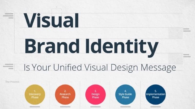
Why Brand Identity Matters More Than a Logo
Most new founders, freelancers, and side-project builders treat brand identity as a single problem: I need a logo. They spend a weekend pushing shapes around in Canva, settle on something that looks 'OK', slap it on a website, and move on. Six months later they are quietly embarrassed by their own homepage and start the whole exercise over from scratch.
The issue is not the logo. The issue is that a logo without the rest of the identity system is an isolated artifact. It carries no weight, no context, and no recognition. Real brand identity is the system: a defined personality, a coherent color palette, consistent typography, a favicon that matches your wordmark, social avatars that match your website, business cards that match your invoices, and a QR code on your business card that scans into a website that uses the same colors as everything else.
The good news in 2026: every single piece of that system can be built with free browser-based tools, in a single focused afternoon, without hiring a designer or buying any subscription. You do not need Adobe Illustrator. You do not need Figma Pro. You do not need a Canva premium plan. You need a few well-chosen free tools, a clear sense of what your brand stands for, and the patience to make one decision at a time instead of trying to design everything in parallel.
This guide walks through the full sequence: from defining your brand personality to generating production-ready assets you can use across your website, business cards, social media, and printed materials. Every step is concrete, every tool is free, and the entire process fits comfortably in three to four hours.
Step 1: Define Your Brand Personality Before Touching Any Tool
Skipping this step is the single most common mistake. Founders open a color picker, choose blue 'because tech is blue', pick Helvetica 'because it looks clean', and build a generic identity that could belong to any of ten thousand other startups. The result is a brand that fails to signal anything specific about what makes you different.
Before you touch a single tool, write down four answers on paper:
- One adjective that describes your brand personality. Not 'modern' or 'professional' - everyone uses those. Try: warm, precise, playful, bold, quiet, technical, human. Pick the one that genuinely fits.
- One adjective for what you are NOT. This is more useful than the first. If you are 'warm', you are not 'clinical'. If you are 'precise', you are not 'whimsical'. The negative space defines the positive shape.
- One existing brand that gets the tone right. Not to copy, but as a reference point. 'I want to feel like Stripe (precise but human)' or 'I want to feel like Mailchimp (playful but professional)'.
- One color you would never use. Most people cannot tell you their brand color, but they can instantly name a color that feels wrong. If neon yellow feels wrong, that is real information.
This exercise takes fifteen minutes. The output looks trivial but acts as a filter for every subsequent decision. When you cannot decide between two color palettes, ask: which one is more [warm/precise/playful]? Same question when picking between two fonts. The personality answer becomes the tie-breaker every single time.
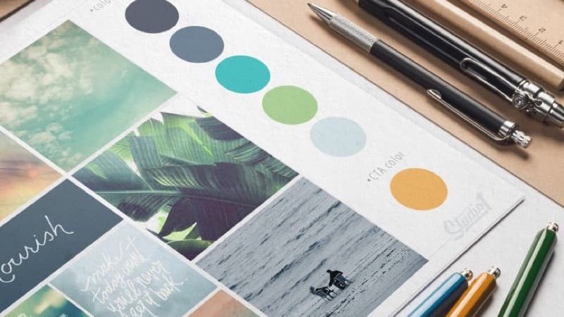
Step 2: Build a Color Palette That Actually Works
Color is where amateur brands most often go wrong, not because the colors are 'ugly', but because the palette does not function as a system. A real brand palette has at least four roles: a primary brand color, a secondary accent, a dark neutral, and a light neutral. Without all four, you cannot build a usable website, let alone a print campaign.
The fastest way to a working palette is to start with one seed color you genuinely like and let a generator build the rest. The color palette generator takes a single hex code and produces harmonized variations using established color theory rules: complementary (opposite on the wheel), analogous (neighbors), triadic (three points), and monochromatic (same hue, varied saturation/brightness). Pick the harmony rule that matches your personality:
- Complementary for bold, attention-grabbing brands (high contrast, energetic)
- Analogous for warm, cohesive brands (low contrast, calming)
- Triadic for playful, creative brands (varied but balanced)
- Monochromatic for precise, minimal brands (single color, layered depth)
If you already have a logo, photograph, or reference image in mind, use the color picker to extract exact hex codes from any pixel. Upload your inspiration image, click the dominant colors, and copy the hex values into your palette. This is how you turn 'I want it to feel like that sunset photo' into a buildable specification.
The number one palette mistake: choosing colors in isolation. A blue you love on a white background can become unreadable as a button on a colored hero section. Always test your palette in the context it will be used.
Once you have four colors, write them down with their roles:
- Primary (#hex) - main brand color, buttons, links
- Secondary (#hex) - accent, highlights, decorative elements
- Dark (#hex) - body text, headings
- Light (#hex) - backgrounds, surfaces
Keep this card open as you make the next decisions. Every asset you generate from here uses one of these four codes, nothing else.
Step 3: Choose Typography That Reinforces Your Personality
Typography is half of your brand identity, and the half most people underinvest in. Two well-chosen fonts will do more for perceived quality than a custom logo. Google Fonts gives you 1,500+ professional typefaces for free, with full commercial use rights and no attribution required.
The rule of thumb is one display font + one body font:
- Display font (headlines, hero text): the personality of your brand. Bold and geometric for tech. Friendly and rounded for consumer. Serif and traditional for finance or law. Look at: Space Grotesk, Plus Jakarta Sans, Manrope, Fraunces, Playfair Display, Crimson Pro.
- Body font (paragraphs, UI text): readability above all. Look at: Inter, DM Sans, Source Sans 3, IBM Plex Sans, Lora (for serif body text).
Good pairings follow the contrast rule: if your display is a serif, your body is a sans-serif, and vice versa. Same-genre pairings (two sans-serifs) work only with significant weight contrast, such as a heavy bold display against a light regular body.
A fast test for any pairing: type your homepage headline in the display font, then type three paragraphs of body text below it. Read it aloud. If your eye jumps comfortably from headline to body and back, the pairing works. If anything feels off (too similar, too jarring, eye strain after one paragraph), try a different combination. This is the same process professional designers use, just faster.
Document your final choice next to your color palette: Display = Space Grotesk Bold, Body = Inter Regular. These two strings will appear in your CSS, your slide templates, your business card design, and your social media graphics. Consistency across all of them is what makes a brand feel real instead of stitched together.
Step 4: Generate a Favicon, Social Avatars, and Brand Assets
Once you have personality, colors, and typography locked, the actual asset generation is the easiest part, and the part where most DIY brands collapse, because each asset gets created in a different tool with different defaults. The fix is to start with one source image and derive everything else from it.
If you already have a logo or wordmark, great. If not, the fastest path is to type your brand name in your chosen display font, in your primary brand color, on a transparent background, and export it as a PNG at 1024x1024 pixels. That is a usable wordmark. It is not creative, but it is coherent with the rest of your system, which is what matters at this stage. You can refine the actual logo later; you cannot ship a brand with no logo at all.
With that source image in hand, the favicon generator produces every size you need: 16x16, 32x32, 180x180 for Apple touch icons, 192x192 and 512x512 for Android home screens, and the SVG version for modern adaptive browsers. One upload, one ZIP file, every favicon variant your website will ever need. Drop the files in your public/ directory, reference them from your HTML head, and your browser tab now matches your brand.
For social media avatars (Twitter/X, LinkedIn, GitHub, Instagram), the same source image works at 400x400 or 800x800. Most platforms accept anything in that range and downscale automatically. Use the same crop and the same background color across every platform. Cross-platform recognition is what makes a personal or company brand 'feel everywhere' even when you are only posting once a week.
If your source files are large (high-res photographs, illustrated logos), run them through the image compressor before uploading. A 50KB PNG looks identical to a 2MB PNG on every social platform but loads dramatically faster on your own website, a real Core Web Vitals improvement, not theoretical.
Once you have personality, colors, and typography locked, the actual asset generation is the easiest part, and the part where most DIY brands collapse, because each asset gets created in a different tool with different defaults.
Step 5: Bridge Print and Digital with a Branded QR Code
Most identity guides stop at the website. In 2026, the bridge between print and digital is the QR code, and a branded QR code on your business card, packaging, or printed materials does more for perceived professionalism than almost any other single asset.
The QR code generator builds a scannable code that uses your brand colors, embeds your logo in the center, and links anywhere you want: homepage, portfolio, contact card (vCard), or Wi-Fi credentials. Use your primary brand color as the foreground (it must be the darker color for scan reliability) and your light neutral as the background. The center logo overlay should match the favicon you generated in the previous step: same image, same proportions, same brand presence.
Three practical settings to get right:
- Error correction level: H (30%). Required for any logo overlay. Lower levels produce scan failures on older phones.
- Logo size: maximum 20% of the code area. Larger and the redundancy cannot recover the covered modules.
- Contrast: high. If your primary color is a mid-tone, switch to a darker brand color for the QR foreground. A pastel-on-pastel code looks elegant in Figma and fails in dim restaurant lighting.
Print this code on your business card with a one-line fallback URL underneath (example.com/about). Five percent of users still cannot scan QR codes reliably; the fallback rescues them. The branded code becomes a small but high-frequency proof point: every business card hand-off shows that you cared enough to make even the smallest visual element on-brand.
Step 6: Document and Distribute Your Brand
The final step is the one that turns a one-afternoon project into a durable identity: write everything down. Create a single file (a Google Doc, a Notion page, a markdown file in your repo, anything that does not disappear) and capture:
- The four brand personality answers from Step 1
- The four-color palette with hex codes and roles
- The two-font pairing with exact Google Fonts URLs
- Links to the source logo file, favicon ZIP, and QR code PNG/SVG
- One-line rules: 'never use red', 'never combine more than two fonts in the same screen', 'always use the dark neutral for body text on light backgrounds'
This document is your brand book. It is the thing you reference when you cannot remember if your blue is #2563eb or #1d4ed8 six months from now. It is the thing you send to a freelance illustrator or a future hire instead of vaguely gesturing at your website. It stops you from drifting, because every founder, given enough decisions, drifts toward 'just this once' exceptions that compound into incoherence.
A brand identity is not a one-time creative project. It is a constraint system that makes every future decision faster. Once you have it documented, designing a new landing page is faster (you already know the colors and fonts). Posting on social media is faster (you already know the avatar and tone). Printing new business cards is faster (you already have the template). The afternoon you spent building this system pays back its time investment within the first month.
The final step is the one that turns a one-afternoon project into a durable identity: write everything down.
Frequently Asked Questions
How long does it really take to build a brand identity using only free tools?
Three to four focused hours, if you have already done the personality work in Step 1. The bottleneck is decision-making, not tool speed. The actual generation of color palettes, favicons, and QR codes takes minutes each. The slow part is choosing between options, which is why pre-committing to a personality adjective helps so much.
Do I need a custom-designed logo, or is a wordmark enough?
A wordmark (your brand name typeset in your display font, in your primary color) is enough to ship. Most successful brands (Google, Coca-Cola, FedEx, Mailchimp) are wordmarks with minor decorative elements. Custom logos can come later, once you know what your brand actually feels like in use. Starting with a wordmark is faster, cheaper, and avoids the 'logo regret' that comes from committing to a custom mark before you understand your own brand.
Can I use Google Fonts commercially without paying?
Yes. All Google Fonts are released under open-source licenses (OFL or Apache 2.0) that explicitly permit commercial use, modification, and embedding in websites and printed products. No attribution is required, no usage fee, no per-impression cost. This is one of the genuinely great deals on the internet.
What is the cheapest way to make my favicon look professional?
Use the favicon generator with a square source image at 1024x1024 pixels. Make sure the central element of your logo is centered with at least 10% padding on all sides. Favicons crop tightly, and edge content gets clipped. The generator outputs all the sizes modern browsers need, including the SVG variant that adapts to light and dark mode automatically.
How do I make sure my brand colors actually meet accessibility standards?
When choosing your dark/light neutrals, aim for a contrast ratio of at least 4.5:1 between body text and background (WCAG AA standard). The color picker shows hex values you can plug into any free contrast checker. If your primary brand color fails contrast against white, do not use it for body text. Use it for buttons and accents, and use a darker neutral for paragraphs.
Can I sell products with a logo and brand assets I generated using these free tools?
Yes. The outputs from the color palette generator, favicon generator, QR code generator, color picker, and image compressor are all yours to use commercially. Google Fonts are licensed for commercial use. The only thing you cannot do is claim the generators themselves or trademark a wordmark that is identical to an existing trademarked brand. That is a legal question, not a technical one.
CSS Layout Tools: Grid, Flexbox, Gradients and Shadows
A practical guide to CSS Grid, Flexbox, gradients, and box shadows. Learn when to use each layout technique and generate clean CSS code fast.
Edit Images in Your Browser: Resize, Compress, Convert
Handle common image tasks in your browser without installing software. Resize, compress, convert formats, and inspect EXIF metadata in seconds.
CSS Generators: Gradients, Flexbox, Grid and Shadows
Use CSS generators to create gradients, flexbox layouts, grid systems, and box shadows. Visual editors output ready-to-copy CSS for your project.